Apple Stores are prospering, but the SVP of Retail slot seems to be a tough sell

It’s hard to go anywhere but down when you’ve been a senior executive at the world’s largest and most valuable consumer company, but former Apple retail VP John Browett seems to have done pretty well, considering the circumstances: he’s just landed the CEO job at Monsoon Accessorize, a U.K.-based purveyor of inexpensive jewelry and handbags. He moved from overseeing Apple’s 401 stores in 14 countries to 1,000 stores in 74 countries. Meanwhile, his appointment reminds us, the world’s most lucrative retail stores still have no official leader. How can that be?

Well, to begin with, they’re not really hurting as a result. At least that’s what CEO Tim Cook explained during a Q&A session at Goldman Sachs’ analyst conference this week. Cook was effusive in his description of the stores, calling the in-store experience “Prozac” for him when he’s having a bad day.

And it’s not hard to see why they make him so happy. The average stores pulls in $50 million in yearly revenue, he said Tuesday. And the stores make about $6,000 per square foot of retail space — twice what next-closest retailer, Tiffany & Co. does.

And, as this chart from Horace Dediu at Asymco shows below, Apple Stores are more popular than ever:

Apple Stores visitors 2013 Asymco

Cook said there were 370 million people that walked through the doors of Apple stores during 2012 — the most ever. Besides just being a place where shoppers can pick up an iPhone or MacBook, the stores function as showrooms for the Apple experience, customer service centers, and places to educate new iPhone or Mac users.

It’s been almost four months since Browett’s exit, and there’s still no SVP of Retail. Cook has been overseeing the group, while Apple is said to be still actively looking for Browett’s replacement. It needs someone who knows retail, understands the value of Apple’s brand, and has international experience, since that’s where most of Apple’s sales growth is coming from. Apple’s at the top of its game in retail in these respects, but apparently the SVP slot remains an extraordinarily hard position to fill. Apple doesn’t appear to be looking inward: longtime VP of Retail Jerry McDougal recently left the company after presumably being passed over for the position. It appears instead to be looking outside the company again, despite the bad experience last time.

In all, the toughest thing about Apple retail is, as we learned from the Browett episode, that it’s extremely high profile with almost no leeway to make significant change. Whoever Cook brings in will likely have to accept simply managing the model that’s already in place; which for the ambitious type Apple usually hires, is probably a tough sell.


Related research and analysis from GigaOM Pro:
Subscriber content. Sign up for a free trial.


Australia Is Killing 1,300 iMac G4s After They Lasted A Full Decade

steveandimacg4macworld

Steve Jobs unveiling the iMac G4 at Macworld 2002

The 2002 iMac G4 is one of our favorite Apple products ever. It had a dramatic design that no one had ever tried by emulating the sunflowers growing in Steve Jobs’ backyard.

Apple discontinued the iMac G4 in 2004, but thanks to Apple’s solid build quality and engineering, a herd of over 1,300 iMac G4′s have lasted a full decade in the service of Australia’s Roads and Traffic Authority (RTA) offices. Sadly, they’re getting thrown away and replaced by Acers.

Back in 2004, the RTA’s chief information officer Greg Carvouni made an unusual decision to implement the 1,300 iMac G4s in the RTA offices. The move was actually a pretty big story in Australian tech news because no one in Australia had gotten behind the Mac in such a major way.

Carvouni has since left his post as chief information officer, but the 1,300 iMacs have stuck around even after the RTA merged with the Roads and Maritime Authority.

New Acer terminals will replace the 1,300 aging iMacs because they’ve started to reach the end of their usefulness. We think they’re probably still more useful that a bunch of crappy Acer terminals, but if the RTA wants to send us a few beat up iMac G4s, we’ll be happy to take them off their hands and make them into something nice.

Source: iTNews

Via: Delimiter


Apple Hiring Software Manager and Engineer to Build ‘Next Generation Features’ for Apple TV

apple_tv_buy_99As noted by 9to5Mac, Apple has posted a job listing seeking a new software engineering manager focused on "next generation features for Apple TV".
The Apple TV team is looking for an experienced engineering manager to help deliver the next generation features for Apple TV. Bring your creative energy and engineering discipline, and help us bring the Apple experience to the Living Room. [...]

- Lead a team of engineers working on exciting new features and functionality
- Drive releases from initial concept to completion
- Work closely with cross functional teams, representing Apple TV across Apple
- Develop the engineering plan for upcoming projects
- Communicate status to key stakeholders and senior management
The managerial job listing comes roughly a month after the company posted another listing seeking an Apple TV software engineer interested in "delivering first in class home entertainment solutions".

While the listings unsurprisingly do not offer any specific information about Apple's plans for the Apple TV platform and are filled with typical human resources phrases designed to appeal to prospective employees, they do suggest that Apple may be increasing staffing to push forward on a television initiative.

Rumors of an Apple television set and/or a new set-top box with increased functionality have repeatedly surfaced over the years, although the company's efforts have reportedly been slowed by content negotiations. A new report from TechCrunch's MG Siegler indicates, however, that Apple may finally be ready to begin its push later this year with a focus on third-party apps for the Apple TV and future hardware.


Recent Mac and iOS Blog Stories
Samsung to Beat Apple to Market with 'iWatch' Competitor?
Dropbox for iOS App Gains Push Notifications for Shared Folders, New PDF Viewer
Former Apple Retail VP John Browett Takes Executive Job at UK Fashion Retailer
Apple Seeds Build 12D68 of OS X Beta 10.8.3 to Developers
Belkin Finally Taking Pre-Orders for Thunderbolt Express Dock
Design, Paint and Print Monsters With Autodesk's '123D Creature'
Kickstarter Launches Official App for the iPhone
NewerTech Releases miniStack MAX Hard Drive/Blu-Ray Burner/SD Card Reader/USB Hub


Apple Might Speed Up Lightning Transfers By Offering Full USB 3.0 Support On iOS Devices [Rumor]

apple-lightning-stock-1024_large_verge_medium_landscape

Even though Apple’s new Lightning connector is super easy to use and quicker than the old 30-pin connectors, it could be better. Right now, the Lightning port on iOS devices doesn’t transfer data at USB 3.0 speeds, even though it’s thought to be able to support it.

A recent listing on Apple’s jobs site might be clueing us in that Apple wants to boost transfer speeds on iOS devices by adding USB 3.0 support.

The job listing calls for a Senior Software Quality Engineer (USB) to join the USB Connectivity Compliance QA Team. Qualified individuals are expected to have knowledge of high speed bus device testing for both USB 2.0 and USB 3.0, along with knowledge of USB triggering and analysis and some other Electrical Engineering and Computer Science skills.

The new hire might be used to help implement the USB 3.0 standard into iOS devices. but seems how it’s just a job posting with few details on what the individual would actually be doing, we don’t really know for sure. However, Apple did add USB 3.0 ports on the newer Macs, so it seems like it’d be a waste if Apple doesn’t update iOS devices to take advantage of those soon, so we think it’s a safe bet that USB 3.0 support will be coming in the future.


Source: AppleBitch


Transform Your Freelance Design Business With The Landing Page Design Kit [Deals]

CoM - Landing Pages

People are more than willing to pay a premium for landing page designers. Why? Because effective landing pages are money makers. They drive sales, leads, and revenue.

Imagine being able to show your clients how your work directly impacted their bottom line. Further to that, imagine that you have just become an indispensable, invaluable part of their business. Well, this Cult of Mac Deals offer will do its part to turn imagination into reality.

The Landing Page Design Kit will teach you how to become that invaluable asset and charge what you’re worth. And now for a limited time get this all-inclusive Landing Page Designer Kit for only $59!

Here’s what you’ll get in the kit:

  • Step-by-Step Video Training: The Landing Page Design Kit includes 53 HD video training that teaches a step-by-step process for designing landing pages that put an emphasis on both visual design and conversion rates. It’s that simple. You can learn more about the lessons here.
  • 300+ Design Templates: Jump start the process of creating your landing page design with over 200 Photoshop design templates created especially for landing pages.
  • Use Unbounce to Test Your Design and Copy: Unbounce is unique because it allows you to both publish and A/B test your designs. Use Unbounce as a testing tool to refine your page and maximize conversions.
  • Save Time by Asking the Right Questions: Very few companies know how to solve their businesses problems with great design. Ask the wrong questions, get the wrong answers and you wind up building on those wrong answers. The LPDK includes a series of worksheets with right questions that get to the bottom of what your buyers really want.
  • Test Your Pages Faster: If you’re not familiar with the Lean Startup methodology, you should be. The LPDK uses a unique blend of Lean Startup concepts and a tool called the Validation Board to help you very quickly iterate your designs based on how well it is achieving it’s goal!

As you can see, The Landing Page Design Kit is a collection of 53 training videos, worksheets, and over 300 Photoshop design templates that give you the tools and knowledge to impress clients with landing pages that convert. We’re so confident that this course will directly impact your bottom line that if it doesn’t, we are giving a 30-day money-back guarantee.

For details on all of the important reminders involving this Cult of Mac Deals offer, check out the Deals page.

Jump into the lucrative landing page design arena with this incredible Cult of Mac Deals offer today. Head over to the Deals page now and pick up The Landing Page Design Kit for just $59 – before this opportunity passes you by!

[subscribebutton]deals[/subscribebutton]


Passbook Passes Now Support NFC… If You Use Them On Android

PassWallet

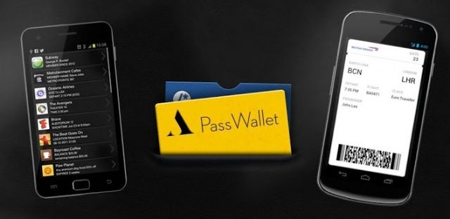
PassWallet, an app that allows Android devices to use passes created for Apple’s Passbook service, has been updated to add supper for NFC. Users can now “beam and redeem” all kinds of passes if they have a supported handset, something Apple’s iOS devices — which don’t support NFC — cannot do.

PassWallet was created by Attido to allow Android and BlackBerry users to take advantage of Passbook files developed for iOS. Apple’s service lets users turn their coupons, tickets, loyalty cards and more into digital .pkpass files, which negate the need to carry a physical copy in their wallet.

Now Attido has teamed up with Skycore, the developers behind CodeReadr, a nifty barcode scanner, to add NFC beaming to its application.

“Passes stored within PassWallet normally present pass IDs as barcodes for scanning but can now also beam pass IDs via NFC and have those IDs validated and redeemed with the CodeReadr app on NFC-enabled Android devices,” the partners told NFC World.

“Apple created the Passbook standard for card, coupon and ticket delivery to iOS devices. My team built PassWallet to fill the gap for the Android platform,” Attido’s Andy Nugent said. “We then expanded the technology to support NFC redemption on Android through our partnership with the CodeReadr team.”

Skycore CEO Rich Eicher believes that the new functionality has the potential to offer a “fast, secure and seamless tap-to-validate process for passes,” one that could greatly improve the functionality of service like Passbook. To prove it, Skycore has created a video that shows the feature in action.

Apple iPhone is over five years old now, and the company continues to shun NFC technology. Passbook has been designed to work without it, but Attido and Skycore are proving how much better it could be if NFC was supported. And this is just a basic example — imagine how NFC could enhance Passbook if Apple got behind it.

Source: NFC World


Every True Apple Fan Should Have This Steve Jobs Poster Hanging On Their Wall [Kickstarter]

Steve Jobs & Nose Jobs. Photo by Tom Zimberoff.

Steve Jobs & Nose Jobs. Now available on Kickstarter. Photo by Tom Zimberoff.

If you read my story about the story behind an incredible photograph of Steve Jobs wearing Groucho glasses during his wilderness years came to being, you might be interested in this: Tom Zimberoff, the photographer behind the shot, has a Kickstarter trying to get funding of a poster version of the shot off the ground.

You should really consider chipping in if you’re a fan of Steve. For $25, you’ll get an 18×24 inch poster of one of two Steve Jobs shots, and if you don’t like that, there’s a poster of George Lucas and Yoda wearing Groucho glasses you can buy instead.

I really love Zimberoff’s work, and with nine days left on this Kickstarter, I really hope it gets off the ground. This is a photo that deserves to be hung on every true Apple fan’s office wall.

Source: Kickstarter


Gene Munster Says He Doesn’t Know What Apple Has Planned For April, But It’s Something!

This guy really believes that Apple is making a HDTV.

Earlier this week the web was assaulted with a bevy of horrible Apple rumors from analyst Peter Misek. Along with claiming that Apple was going to have an Apple TV SDK event in March, Misek said Apple’s 4.8-inch iPhone will launch next year, and that iPhone 5 sales are slipping.

It only took a few minutes before Misek’s B.S. was shot down, so rather than launching his own barrage of crappy Apple TV rumors, Piper Jaffray’s analyst, Gene Munster, decided to tell investors he has no idea what Apple’s got up it’s sleeve right now, but there’s surely something.

In his note to investors this morning, Munster took a more humorous tone. Rather than making a claim based on “supply chain sources,” Munster admitted that he doesn’t have an inside line on what Apple is doing right now but Apple’s probably going to do something in March or April.

Munster did make the argument that Apple typically has a new product announcement every four months (true), and that they’ve had Special Events in March for the last two years. The last Apple announcement was October 23rd, so Munster figures that Apple is due to bring something out really soon.

Normally, we’d agree that past behavior dictates future performance with Apple, but the only new product rumors that we’ve been hearing lately were in regards to the iWatch, which probably isn’t going to come out in 2013. If a Retina iPad mini was on the way, we probably would have heard some leaks by now, or will in the next few weeks. If not, then I wouldn’t hold out hope for an Apple event in March, especially now that Jim Dalrymple has said it’s not happening.

Source: Business Insider


Skype Launches New Video Messaging Service On Android, iOS & Mac

Skype-G-S-III

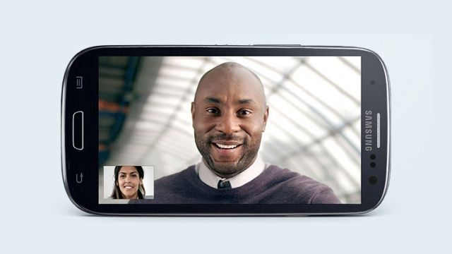
Skype has today launched its new Video Messaging service on Android, iOS, and Mac. Available to those in the United States and the United Kingdom initially, the feature allows users to send their friends videos up the three minutes long when they have a lot to say.

Videos can be sent to users who are online and offline, and they are delivered within a chat window — just like a traditional instant message. If you receive them on a Mac, then the videos can be downloaded and stored locally, which is great if you have a message you’d like to cling onto.

The feature doesn’t yet support Windows, or Windows Phone devices — which is surprising when you consider that Skype is now owned by Microsoft. Users with Windows devices will be able to receive message from their friends, they just won’t be able to send them.

So if you have a supported device, you can send all of your Windows chums a lovely message to tell them how great Video Messaging is.

“We’re pleased that there’s interest for Video Messaging to come to Skype for Windows and Skype for Windows 8,” a Skype spokesperson told The Verge in response to Windows availability. “We’ll let you know when we expand the service to the platform.”

Video Messaging is being rolled out to users as we speak, so if you’re in the U.S. or the U.K., you should be able to enjoy it soon. Other countries will be supported later on.

Via: The Verge


Kindle App Vs. iBooks. (Spoiler: They’re Virtually Identical Now!) [Feature]

Roadside Picnic

Which is which?

Yesterday, Amazon’s iOS Kindle app was updated to add multicolor highlights, “Book End Actions” (rate, review, share, see recommendations) and to fix the brightness control, which now stays set across app switching or sleep.

At first I thought “Meh, iBooks has had most of that since forever.” And then I thought “Wait, are there any differences left between these two apps?”

The answer is — of course — yes. But it’s more complicated than that…

Today we’re talking only about the iPad versions of Kindle and iBooks.

History

From the beginning, the two apps have had different goals. Kindle was made to let you read your Kindle books on your iPad, with almost no considerations for aesthetics. It has, over the years, gotten a lot prettier and easier to use, and is now almost identical to iBooks when you’re in full-screen, chrome- free reading mode. Almost.

iBooks has always looked good, and has changed a lot less than Kindle. It launched with a bookshelf view that Kindle waited years to get, and it has the advantage of a built-in bookstore. If iBooks had a purpose, it was to prove that the iPad could be a great e-reader, and to demo well.

Feature iBooks Kindle
Reading
Fonts 7 5 (plus publisher font)
Font size adjustment Yes Yes
Text justification Yes No
Scrolling Yes No
Color Themes White, black, sepia White, black, sepia
Bookmarks Yes Yes
Brightness Yes – system Yes – extended dimming
Adjust margin size No Yes
X-Ray No Yes
Notes and Highlights
Highlight 4 colors 4 colors
Copy text Yes No
Notes available outside book No Yes, web-only

Looks

IBooks looks better than the Kindle app, but — somewhat ironically — Kindle has more text options. Aesthetics will also weigh heavily in the other sections of this piece, so I’ll stick to the library view and the reading view here, as they pretty much set the scene.

Text

Recent updates have brought Kindle almost in line with iBooks.

Single Plain Page

When reading, the differences are tiny but significant.

The biggest differences are that Kindle lets you adjust the width of the margins, which is good news after a recent update filled the reading screen with text from edge to edge with no way to change it. IBooks won’t let you change this but the default choice is just fine, leaving the body text breathing room but not forcing too many extra page turns.

And iBooks will let you switch justification on and off (justification is where words are stretched to fill a line, making sure the edges of the text are always neat on both sides), and toggle auto-hyphenation. As these are the issues in typography most likely to cause a fistfight, they’re good options to have.

Neither app lets you change line spacing (although the hardware Kindle does). For me, iBooks wins here with slightly looser spacing.

Fonts
Fonts

iBooks has more fonts, but Kindle has more ugly chrome. Result: a tie.

The font choice in iBooks is bigger and more varied. Both apps contain Palatino and Georgia, but otherwise they have their own lists. All the screenshots here use Palatino for a fair comparison, but the your choice will depend on your own taste, and on the device you’re using. I prefer Charter in iBooks on the Retina iPad, but the same font seems too heavy on the iPad mini (where I use Iowan). In Kindle, I use either “publisher font” (which is a mystery-meat typeface that sometimes appears) or Palatino.

The Page

When you’re in the “sepia” mode, iBooks is a little less brown and a little more contrasty. It wins if you’re taking screenshots, but when reading, there’s really no difference.

iBooks’ stupid fake-book look can be switched off, but you’re stuck with the curling page-turn animation whether you want it or not.

What does make a difference is the way the pages turn. IBooks’ stupid fake-book look can be switched off, but you’re stuck with the curling page-turn animation even in the Full Screen theme, which can feel annoyingly slow. Kindle wins here thanks to it’s simple slide-across animation which slides one page off and the next one on.

But iBooks’ secret weapon is scrolling, which does away with pages altogether (well, almost — the page number readout still works) and replaces them with one long scrolling page, just like the web. This works great on the iPad mini, and makes reading seamless. After all, why bother with pages at all? They’re just a relic of paper books.

To complement this scrolling feature (although it works just as well with pages) is what I like to call “Thumb Ignorance.” It works in many apps, and means that iOS ignores any fingers you use to hold the device. Thus, if you have planted your right thumb in the middle of the screen to hold you iPad mini one-handed, you can (after a short pause) use your other hand to swipe between pages. It’s just like paper!

The Kindle app won’t do this: it insists on highlighting the words under your thumb. And iBooks can still be a little skittish about where you put your thumb. The best way is to plant it on a bit of blank page between paragraphs and then slide it into position. This avoids activating the selection loupe (bonus tip: this also works in the Mr. Reader RSS app)

Metadata
Top bar

This is what you’ll see up top.

Both apps indicate your progress with an indicator at the bottom of the screen. Kindle’s is an ugly slider with a blob on a stick. IBooks uses a dotted line. Both can be used to scroll through the book.

Both apps also put page numbers at the bottom of the screen, and the Kindle will also give you a progress percentage, and you can toggle between real page numbers (which correspond to a paper version of the book) or Amazon’s location numbers by tapping. IBooks also tells you how many pages are left in the current chapter.

Bottom bar

Down low… Too slow!

Both apps also have a “back” button. This is used after searching, for instance, to return you to your place in the book. Kindle has a left-pointing arrow, and that’s it. IBooks is far superior, with tappable text telling you where it will take you: “Back to page 130,” for example. And when appropriate the bottom right corner will also offer a shortcut like “Go to page 180.”

Brightness

In-app brightness adjustment seems to be a moving target, so often does it change. Currently, iBooks just gives you a slider which will control the regular system brightness, just as you could if you double-tapped the home button and did it from there.

Screen Dimming

iBooks’ dimming doesn’t show up in screenshots as it uses the system brightness controls. Kindle adds its own dark mask on top of that, to good effect.

Kindle — in the latest update — now only fake-dims the screen. That is, it doesn’t adjust the actual screen backlight at all. Instead, it changes the color of the on-screen images to appear darker and of lower contrast. This doesn’t affect standard interface elements, though, so when you pop over the fonts panel, say, it appears at full brightness. This is annoying, but it does mean that you can get the perceived brightness down way lower than you can with iBooks: great for reading in bed in pitch darkness.

Previous version of both apps have done things differently. As I remember it, iBooks used to dim the backlight further than it could go in any other way. And Kindle used to control system brightness, only with an added bottom end that kicked in with its faux-dimming. This may have been tricky to implement, as it always reset itself if the app slept or you switched to another app and back again. This is now fixed.

X-Ray

Amazon has a neat feature called X-Ray, which works with books that support it. Tap the X-Ray button on any page and you get a new screen listing all the characters, locations and even brands that appear in on that page, along with a timeline that oyu can tap to see all instances of that person or place in the book.

Xray

Only Kindle has X-Ray, and it’s surprisingly useful.

You can also choose to view this list by chapter, or by the whole book.

Characters are summarized (handy in books with lots of minor characters, or who the author has stupidly decided to give names starting with the same letter) and places and other info is pulled in from Wikipedia.

It seems like a gimmick, but it’s often a lot easier to quickly check X-Ray than it is to search back to find out who this minor Frodo character is.

Whispersync For Voice

Kindle can also use Whispersync For Voice. This lets you read the e-book edition, but then switch to the human-narrated Audible audiobook edition without losing your place. The idea is amazing: you can read the book over breakfast, and then switch to the audiobook when you head out to the car and drive to work. The problem is that you need to buy both editions, and that they need to be compatible. Still, it’s pretty cool, and you don’t ever have to use it if you don’t want to.

Sync

IBooks can sync your notes and bookmarks between your iOS devices, but Kindle syncs with all of these plus your e-ink Kindle, plus your Mac, plus the web-reader, plus pretty much any piece of hardware you might own. This is the single reason I read in the Kindle app — I own a hardware Kindle for reading in bed or outdoors, and syncing is pretty essential to that.

Sync

Kindle warns you before changing your spot in the text.

Syncing is seamless on both platforms, with some differences. Kindle asks you if you want to update your position to the furthest read amongst all your devices, and tells you what position it’ll go to and when one of your devices synced that position. IBooks just does it without telling you.

Notes

To be honest, notes on both platforms are pretty lame thanks to the fact that they’re trapped. IBooks notes can only be read in iBooks, or (if you use it) iTunes U. IBooks will also let you e-mail individual notes.

Taking Notes

Mmm!… Ugh… Winner: iBooks

Kindle will consolidate all your notes in one place, but that place is a dynamically-generated web-page which you’ll need to visit whenever you want to see them (you can of course view notes in the book itself).

When it comes to viewing notes, iBooks looks nicer as it hops to a full-screen view (Kindle uses a tiny popover, which shows how serious it is about your note-browsing), but neither lets you search notes or highlights.

Browsing Notes

Notes are in a walled garden on both platforms, but at least Apple gives you a full screen to read them on.

IBooks does have one big advantage: it lets you copy text. Nope, the Kindle app might let you highlight and share text to Twitter and Facebook, but you can’t copy a single word to the clipboard.

And while we’re on the subject of stupidity, Kindle uses it’s own dictionary for lookups. This is fine, especially as you can choose from many different languages, but if you don;t have a dictionary installed it should default to the system one. If I have a 16GB device, the last thing I want to do is fill it up with something that duplicates the perfectly good built-in dictionary.

Buying Books

Ever since Apple told Amazon to stop linking to the Kindle store from its app, buying books has been a real pain. Whereas iBooks’ store is built in and you can upgrade from a sample to the full book with a single tap, buying Kindle books forces you out into the browser.

However, recent updates have made this less annoying. Here’s how you had to upgrade from a sample to the paid book a few months ago:

  • Finish sample. Decide to buy the book
  • Close app
  • Open browser and navigate to Amazon’s Kindle Store
  • Search for book
  • Buy book, choosing to send it to the right device
  • Return to the Kindle app and make a note of a phrase on the last page of the sample (no copying, remember?)
  • close the sample
  • Open the newly-purchased book
  • search for the term you have in your mind’s pasteboard
  • Continue reading
  • At some point, delete the sample from your device

Now, the first part is still necessary — Amazon still isn’t allowed to link to its store — but once you buy the book, things are much improved. The sample is replaced by the new, full book, and your reading position is synced. This is way better.

The other advantage of buying Kindle books is that you can strip the DRM and convert them to EPUB, so they can be read in iBooks or any reader you like. IBooks’ DRM remains strong. This is why I by all e-books from Amazon, then crack them every few weeks in a batch, and then store the resulting files in my Dropbox, ready to be opened in iBooks if I want to. And no, I don’t share then with anyone else.

Conclusion

Despite iBooks ravishing good looks, I prefer Kindle for its brains. The main thing is the Whispersync between all my iOS devices and my Kindle. But as I buy all my books from Amazon, if I did use iBooks I’d have to fire up my Mac to crack every book right after purchase. This is clearly absurd, so Kindle is the way to go.

Sure, there are feature discrepancies between the two, but when it comes to actually reading — which is what you’ll be spending the most of your time doing — both apps put the words on the page perfectly adequately. Do I sometimes wish that Kindle had more space between the lines? Sure. But when I’m caught up reading a great story, I don’t notice. And if I do, then I’m reading the wrong book, not using the wrong app to do it.